|
0 Comments
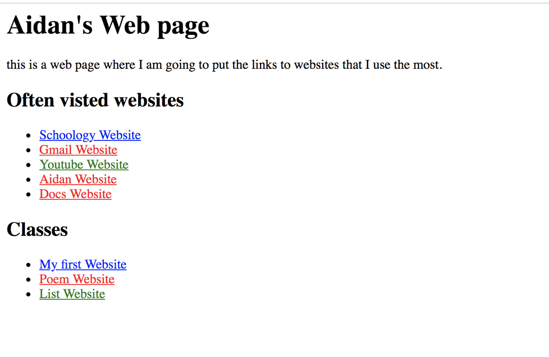
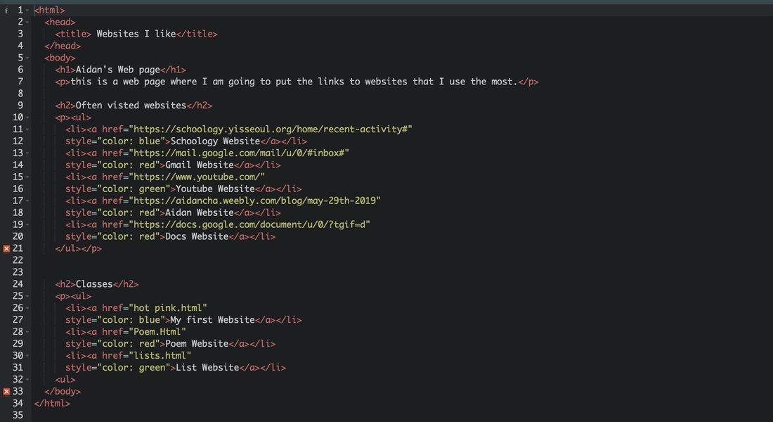
For this assignment I learned how make order and unordered lists on sublime text. I think that this one was the hardest because I messed up a lot when I was making the sublime. 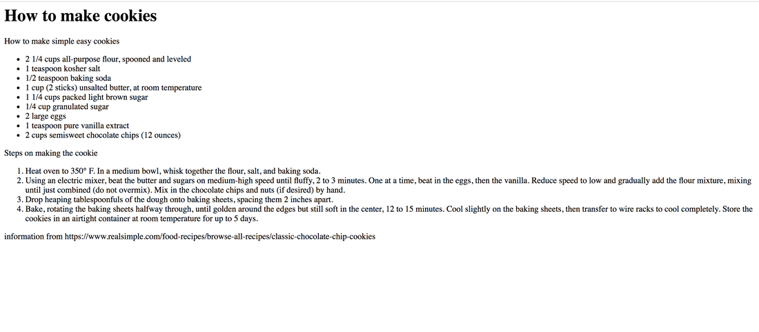 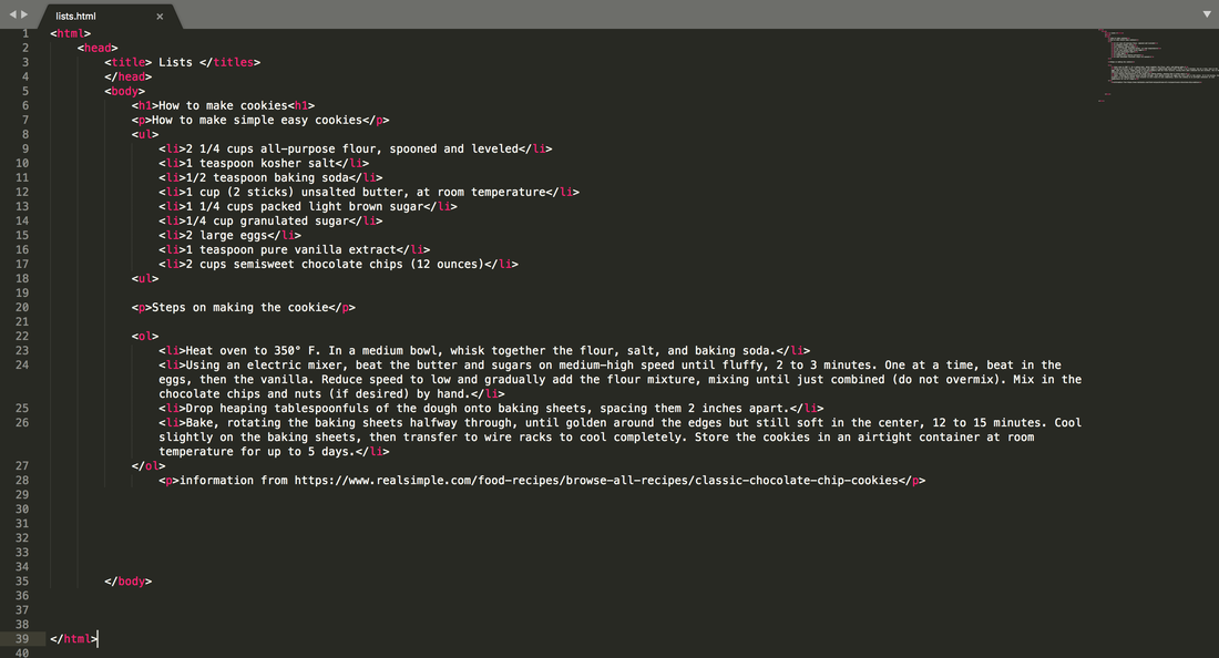 I made a poem by using sublime text. It was not that hard because I think I got a better understanding on how to use sublime text. 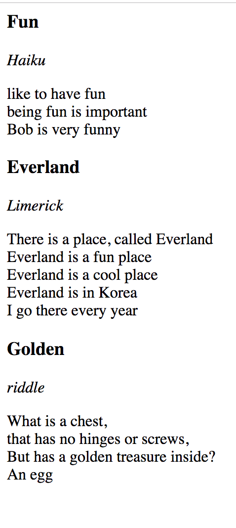 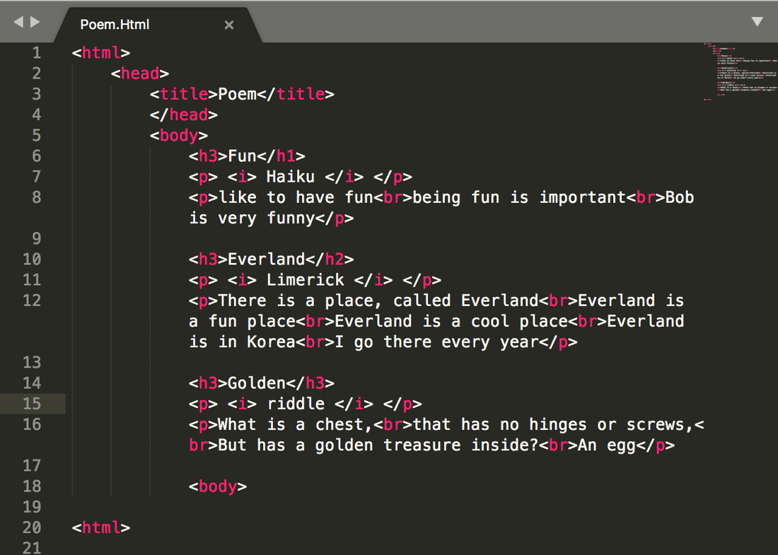 For this assignment I was asked to make 3 versions of each logo I vectorized. I had to change the font a little bit and the color a little bit for all my 3 versions. Then I had to make it into a 3x3 grid and the logos have to be similar in size. I think the most challenging part for this assignment was changing the colors and the font on my logos because on my original logo I thought that the colors and font already match really well so when I had to change it I had some challenges on how I should change it. I think my favorite process about this is when I was making the logo because first I thought that I would not be able to do it but once I got the hang of it, it was really fun. I learned that taking your time when vectorizing is worth it because in the end it looks much better. 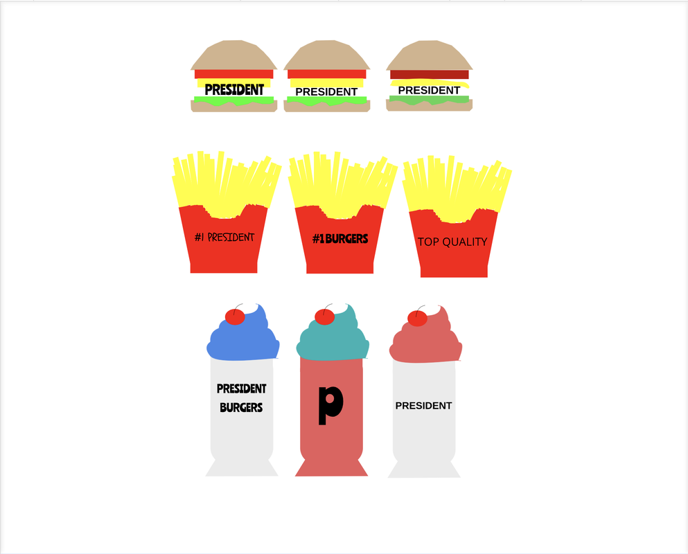 The logo that I choose was the bottom left corner logo. The milkshake logo that is dark blue. The name of my brand is called President. The reason why I call it President is because the President is one of the most important people in their country and I would like my restaurant to be one of the most important restaurants in the country. I want my restaurant to be a fast food place so it is affordable and tasty for everyone. The reason why a milk shake is my logo is because a milk shake in one of the main items on a menu at any fast food restaurant. Also milk shakes go well with burgers and my restaurant makes burgers. The reason why I like this logo is because it is really simple and I think it would stand out really well when people see it. 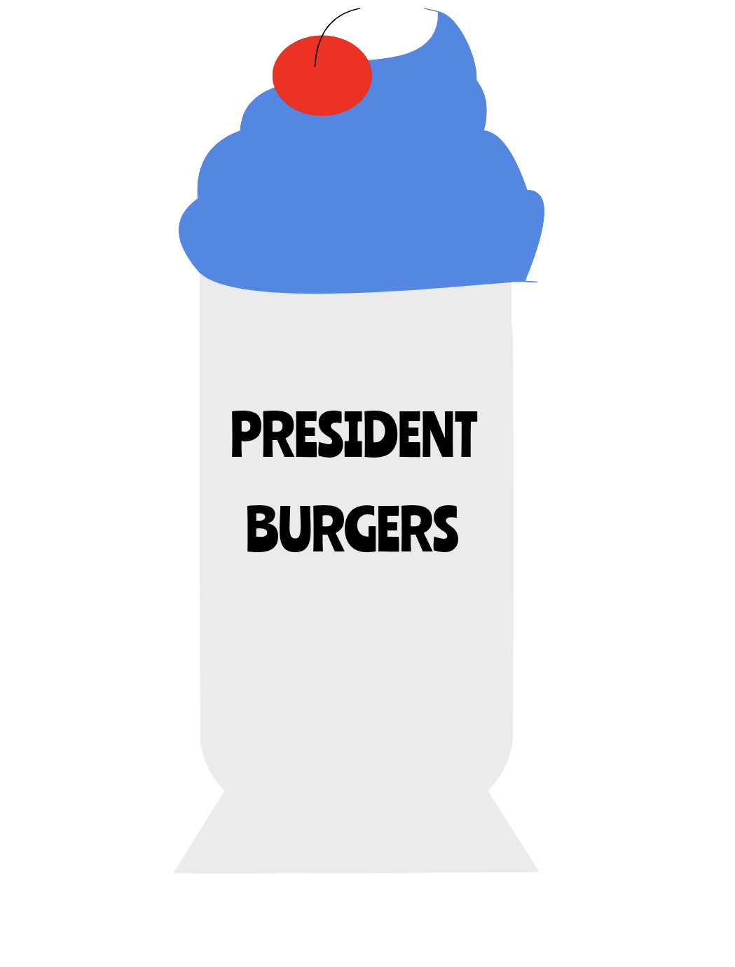 For this assignment I learned how to make a sublime text. I first thought that it would be really hard but once I started it I got the hang of it.  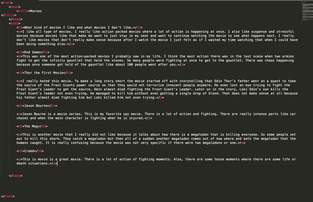 Today I made a 15 different kind of logos for a company that I made and 15 words that describe my company. I decided to make my company a fast food burger place because my favorite food is a burger. I want my restaurant to be a affordable and delicious for everyone. I would also like to keep my menu small and simple. I decided to name my restaurant President because a President is one of the most important people in their country and I would like my restaurant to be one of the most important restaurants in the country. I circled the 3 logos that I am going to do. It is the President Burgers, #1 President, and President Top Quality. I first found this process hard but once I got the hang of it I enjoyed it more. 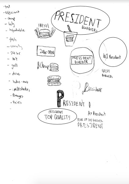 In this assignment I was asked to make color palettes. The type of color palettes that we used were monochromatic, analogous, complementary, and triadic. Under each color palette we had to choose have 5 colors. We used a site called Adobe colors for this assignment. On adobe colors we have change the scheme to one of the 5 palettes and choose 5 different colors according to the type of palette. Then we go to gravit.io and make 5 different titles that say monochromatic, analogous, complementary, and triadic. Under each title we have to have 5 shapes that have the colors that we choose in adobe colors. We also had to label the hex code on each shape. This is the link for Adobe colors . This is the site that I used to make my palettes. The 4 different types of color schemes is Monochromatic, Analogous, Complementary, and Triad. Monochromatic has one hue and various saturations and brightness levels. Analogous has hues that are next to each other on the color wheel. Complementary combines hues from opposite sides of the color wheel. Triad combines 3 hues evenly spaced around the color wheel. I think that my favorite color schemes is monochromatic because I really like how everything blends together really well. color.adobe.com/create/color-wheel/ 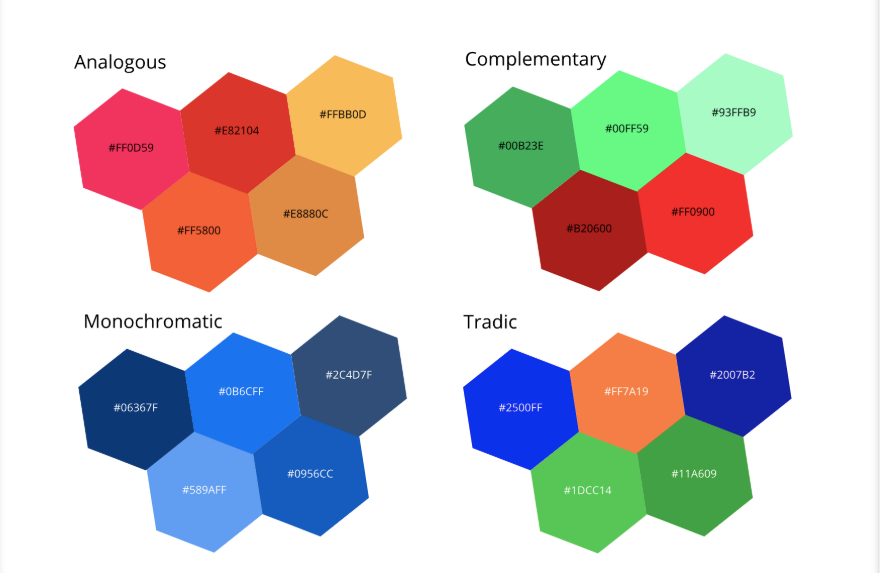 For this assignment I was asked to make an artwork that shows 15 different types of colors either with simple shapes or a piece of art work. Then I had to label the shapes with what HEX unit it is and what type of RGB value it is. Also everything has follow the CRAP Design Principles. Some challenges that I faced were making everything aligned. I had some difficulties making the text boxes aligned. I overcame these challenges by making all my shapes bigger so that it would be easier to align. Something that I achieved really well in this project was figuring out what I did wrong and fixing it because in most projects when I am fixing a mistake it would take me a really long time to fix but in this project I mange to fix my mistakes quicker. Something that I am really proud of is staying focused and by staying focused I was able to finish my work very efficiently. Tools that I used in Gravit were the alignment tool, the star tool, text box, and different kinds of fonts. There was not really concept behind this artwork but the reason why I choose a star is because my favorite shape is a star. 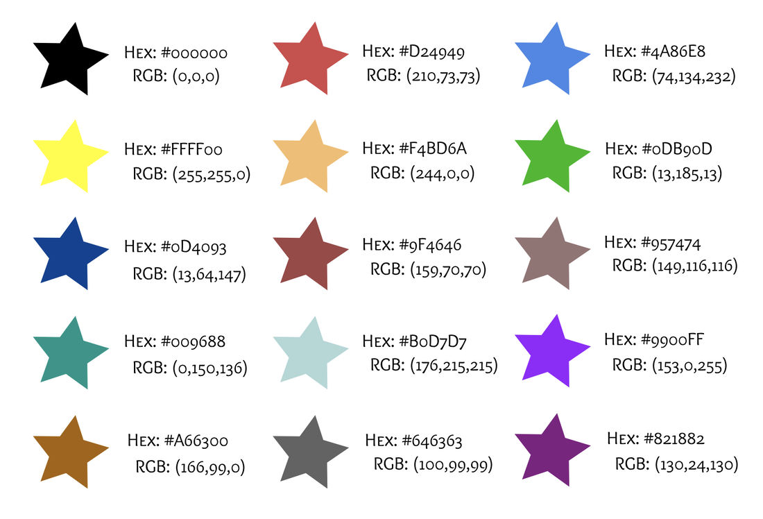 Throughout this year we have been learning many different things in Technology. One of the topics that we learned is typography. Typography shows a better definition of a font. Typography is important because it emphasizes a word and also gives us a better understanding. For example, if you see a stop sign that is all capitals it emphasizes and gives you a better understanding to stop but if you see a stop sign that is all lower case it does not emphasize and give you a better understanding you to stop. “Each font has a personality and a purpose”. I think this quote means that every single font in the world has a definition and a reason why it is here. Now I will talk about 5 fonts that I learned this year. Novelty. This font looks like a unique font looks like it would grab attention. This font would be used sparingly. Serif. This font looks like it has ledges sticking out at the end. It also seems it would be used in a news article. San Serif. This font has no feet at the end of it. It would be used in a web. Monospaced. This font looks like each letter has the same amount of space. It would be used in coding. Lastly script/hand. This font looks like cursive, calligraphy, and handwriting. This would be used for logos, head lines, and details. So that in everything that I learned about typography. Typeface ComparisonI was asked to make text boxes that a word in it and has to have 5 different fonts in them with the type of font I used and the name of the font that I used. I made this by first making the page A4 size and then I alined the text boxes with rectangles. 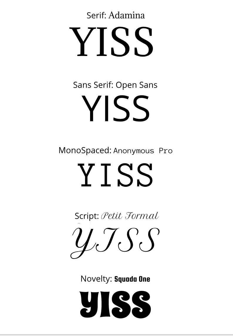 Word PortraitsI was asked to make a 20 words and each of them must be a different font. For each font one word must describe the font and the other font must be opposite with the font. I made this by first making the page A4 size and then I alined the text boxes with rectangles.  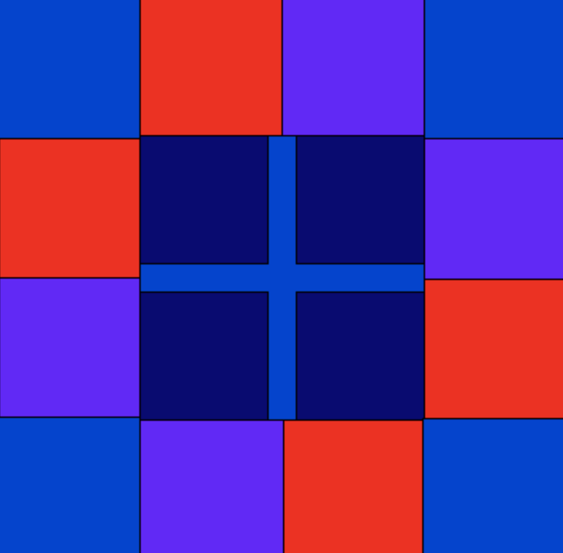 This is the art work that I made through coding. I made a lot of rectangles and made a pattern with them. In the beginning I struggled a little bit but as I got through I found it easier. I learned that coding can be a struggle sometimes but when you get a hang of it coding can get very fun. The reason why I made this image is because when I was a baby I had a very similar image that my mom made for me and it was right next to my bed. So I wanted to re create it. I did not really remember the colors of it but I remember the patterns.
This is my code= fill(255, 0, 0); rect(200, 200, 200, 200); rect(1, 1, 200, 200); fill(111, 0, 255); rect(1, 200, 200, 200); rect(200, 1, 200, 200); fill(4, 63, 212); rect(100, 100, 200, 200); fill(18, 0, 117); rect(100, 100, 90, 90); fill(18, 0, 117); rect(210,100, 90, 90); fill(18, 0, 117); rect(100, 210, 90, 90); fill(18, 0, 117); rect(210, 210, 90, 90); fill(4, 63, 212); rect(0,2, 100, 100); fill(4, 63, 212); rect(0, 298, 100, 100); fill(4, 63, 212); rect(300, 2, 100, 100); fill(4, 63, 212); rect(299, 299, 100, 100); |
|
 RSS Feed

